
05 · Foundations
Candlestick Fundamentals
Every chart is a story told one candle at a time. Learn the alphabet before you read the sentence.
Every candle on your chart is a compressed record of a battle between buyers and sellers over a fixed window of time — a minute, an hour, a day, whatever timeframe you’re viewing. Once you can read that record fluently, you stop seeing “lines going up and down” and start seeing who won each round.
Anatomy of a Candle
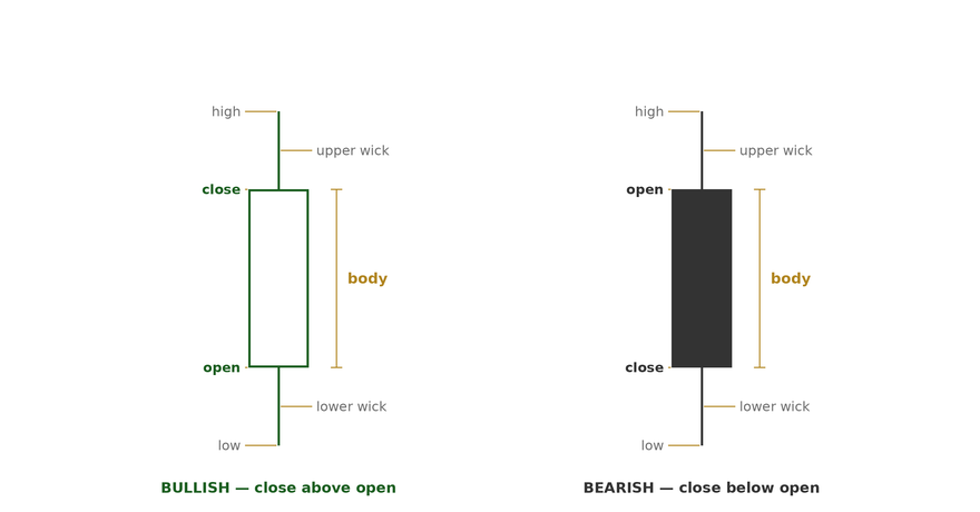
Four data points build every candle: the open (price at the start of the period), the close (price at the end), the high (the highest price reached), and the low (the lowest price reached). The thick part of the candle — the body — is the distance between open and close. The thin lines extending above and below the body — the wicks — show the full range price traveled before settling where it did. A green body means the close was higher than the open; a red body means the close was lower.
The Three Candle Types
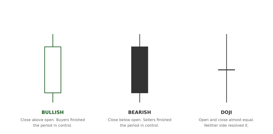
Every candle falls into one of three buckets. Bullish candles close above where they opened — buyers controlled the period. Bearish candles close below where they opened — sellers controlled the period. Doji candles close almost exactly where they opened, which signals indecision: neither side could take control, and a change in direction often follows.
High-Probability Reversal Signals
Individual candles become far more useful when you know which shapes tend to mark a turning point. These four show up constantly and are worth memorizing cold:
What to look for
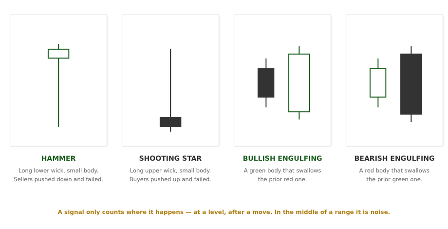
Hammer — forms after a downtrend. A small body near the top of the range with a long lower wick shows sellers pushed price down, but buyers reclaimed it by the close.
Shooting Star — forms after an uptrend. A small body near the bottom of the range with a long upper wick shows buyers pushed price up, but sellers took it back by the close.
Bullish Engulfing — a small red candle is completely swallowed by the next green candle’s body. Buyers didn’t just stop the slide, they reversed it in one period.
Bearish Engulfing — a small green candle is completely swallowed by the next red candle’s body. Sellers didn’t just stop the rally, they reversed it in one period.
None of these patterns work in isolation. A hammer at a random point on the chart means very little. A hammer forming exactly at a volume shelf or a prior support level, on above-average volume, is a completely different signal — and that’s the theme of everything that follows in this book: context and confluence turn a decent signal into a high-probability one.